TabRow in Jetpack Compose: Implementation & Customization

In this article, we will be implementing and then customizing the feature of “switching between different screens with tabs” in Jetpack compose.
Final Output:
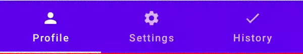
The provided TabRow design is so boring and old fashioned(without searchbar)..

So, we are going to customize it a little and make it more fun & attractive(no searchbar implementation)..

Dependency:
def accompanist_version = "0.28.0"
implementation "com.google.accompanist:accompanist-pager:$accompanist_version" // Pager
implementation "com.google.accompanist:accompanist-pager-indicators:$accompanist_version" // Pager Indicators
Creating TabItem:
For each Tab, you may need multiple things that are specific for each tab. But, normally you might be just using only Title, Icon and a Composable screen for each Tab. So, create a data class for best practices.
data class ImageTabItem(
    val text: String,//Tab Title
    val icon: ImageVector,//Tab Icon
    val screen: @Composable ()->Unit//Tab Screen(can also take params)
)
Implementing Tabs:
Now, firstly we need to create a list of TabItem that we are going to display inside of a TabRow.
//This will be inside of our same composable where we are creating TabRow
val tabRowItems = listOf(//List of tabs to use later
    ImageTabItem(
        text = "Profile",
        icon = Icons.Default.Person,
        screen = { Profile() }
    ),//First TabItem
    ImageTabItem(
        text = "Settings",
        icon = Icons.Default.Settings,
        screen = { Settings() }
    ),//Second TabItem
    ImageTabItem(
        text = "History",
        icon = Icons.Default.Check,
        screen = { History() }
    )//Third TabItem
)
Now, we will use and iterate over this list to display each Tab Item inside of our TabRow.
Inside of our TabRow, we also need to store the state of our selectedTab, so we will use PagerState for that.
val coroutineScope = rememberCoroutineScope()//will use for animation
val pagerState = rememberPagerState()//store page state
Now, create a TabRow:
Column(modifier = Modifier.fillMaxSize()) {//bcz we will display screen below TabRow
    TabRow(
        selectedTabIndex = pagerState.currentPage//use pagerstate or any variable you created to store state
    ) {
        //...
    }
}
Now, inside this we will iterate over our TabItem list that we previously created and display each tab item.
{//Inside of TabRow
    tabRowItems.forEachIndexed { index, item ->//iterate over TabItem List
        Tab(//Create tab for each item
            text = { Text(text = item.text)},//display Text
            icon = { Icon(imageVector = item.icon,"") },//display icon
            selected = pagerState.currentPage == index,//select only when current index is stored page
            onClick = { coroutineScope.launch { pagerState.animateScrollToPage(index) } }//animate scroll onClick
        )
    }
}
We, just created a working TabRow, but it will not display any screen currently.
Now, add a dedicated screen for each tab, and that will be the composable we added in our TabItemList.
To have to swipe in Screen(Paging) feature, we will be using a HorizontalPager to display our screens.
//Iniside of our Column and below our TabRow
HorizontalPager(
    count = tabRowItems.size,
    state = pagerState,
) {
    tabRowItems[pagerState.currentPage].screen()
}
That’s it, we just implemented our whole Tabs functionality.
Full Composable function will be:
@Composable
fun PagingScreen(){
    val coroutineScope = rememberCoroutineScope()
    val pagerState = rememberPagerState()

    val tabRowItems = listOf(
        ImageTabItem(
            text = "Profile",
            icon = Icons.Default.Person,
            screen = { Profile() }
        ),
        ImageTabItem(
            text = "Settings",
            icon = Icons.Default.Settings,
            screen = { Settings() }
        ),
        ImageTabItem(
            text = "History",
            icon = Icons.Default.Check,
            screen = { History() }
        )
    )

    Column(modifier = Modifier.fillMaxSize()) {
        TabRow(
            selectedTabIndex = pagerState.currentPage
        ) {
            tabRowItems.forEachIndexed { index, item ->
                Tab(
                    text = { Text(text = item.text)},
                    icon = { Icon(imageVector = item.icon,"") },
                    selected = pagerState.currentPage == index,
                    onClick = { coroutineScope.launch { pagerState.animateScrollToPage(index) } }
                )
            }
        }
        HorizontalPager(
            count = tabRowItems.size,
            state = pagerState,
        ) {
            tabRowItems[pagerState.currentPage].screen()
        }
    }
}
Current output:
Ignore the SearchBar, that came from different screen and was a part of my project.
Customization:
The stuff we created is working fine, and you can just stop reading here, but if you want your project to have a attractive look, then you’ll definitely customize it. So, now I will show you my customizations for TabRow.
- I don’t need any Text or Icon in my Tab() item, so I just used an Image and set it as the background of my Tab after removing both Text and Icon parameter from Tab() composable.
//Inside TabRow
Tab(
    modifier = Modifier
        .clip(RoundedCornerShape(50))//Round shape for each item
        .padding(horizontal = 16.dp)//Padding to fit inside Shape
        .paint(//Use this to add a background Image
            painter = painterResource(id = item.logo)//Add "logo" as a Int in your TabItem data class
        ),
    //...
)
I have imported some images in projects and using them here after defining them in the TabRowItems list.
2. I will also modify the TabRow background to have a round shape for a consistent look.
TabRow(
    backgroundColor = Color.Transparent.copy(0.1f),//To separate it from background
    modifier = Modifier
        .padding(vertical = 4.dp, horizontal = 8.dp)
        .clip(RoundedCornerShape(50)),//Consistent look
    selectedTabIndex = pagerState.currentPage
)
3. Already looking good enough, but I wanted more customization and after final touch of adding a custom “indicator” in TabRow..
//You can alaso copy this as it is
@OptIn(ExperimentalPagerApi::class)
@Composable
private fun CustomIndicator(tabPositions: List<TabPosition>, pagerState: PagerState) {
    val transition = updateTransition(pagerState.currentPage, label = "")//Do transition of current page
    val indicatorStart by transition.animateDp(//Indicator start transition animation
        transitionSpec = {
            if (initialState < targetState) {
                spring(dampingRatio = 1f, stiffness = 50f)//Using spring
            } else {
                spring(dampingRatio = 1f, stiffness = 100f)//Change stiffness according to your need
            }
        }, label = ""
    ) {
        tabPositions[it].left
    }

    val indicatorEnd by transition.animateDp(//Indicator end transition animation
        transitionSpec = {
            if (initialState < targetState) {
                spring(dampingRatio = 1f, stiffness = 100f)//Or you can change your anim here
            } else {
                spring(dampingRatio = 1f, stiffness = 50f)
            }
        }, label = ""
    ) {
        tabPositions[it].right
    }

    Box(//Using a whole box around the Tab
        Modifier
            .offset(x = indicatorStart)
            .wrapContentSize(align = Alignment.BottomStart)
            .width(indicatorEnd - indicatorStart)
            .fillMaxSize()
            .border(BorderStroke(2.dp, Color(0xFF00FFCC)), RoundedCornerShape(50))//Change border here
            .padding(5.dp)
    )//You can also add a background, but then also use zIndex
}
Use this custom indicator inside of TabRow
TabRow(
    //...
    indicator = { tabPositions ->
        CustomIndicator(tabPositions = tabPositions, pagerState = pagerState)
    }
)
Note: The ripple effect was not working as expected because we added padding with the Image background and that cause Tabs to have a smaller size. Let me know, if you can have any workaround.
That’s it!! Enjoy your cool TabRow and paging feature with this attractive design.
Full code here: https://github.com/Sagar0-0/PixHub/blob/master/app/src/main/java/com/example/pixhub/ui/screens/ImagesSearchGrid.kt
I hope you found this helpful. If yes, then do FOLLOW me for more Android-related content.
#androidWithSagar #android #androiddevelopment #development #compose #kotlin
